
Friday, 11 November 2016
Audience theories and research:
I have created a mindmap on mindomo, which does not allow to embed onto blogger, I have created a screenshot of the mindmap I have created which is research into different audience theorists and how I can incorporate them into my film as well as finding existing example to ensure this is a convention which I can consider into my work. To see the full mindmap, click onto : https://www.mindomo.com/?join=aNWsBj&cmp=0&src=0


Pitch script ideas
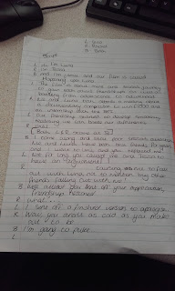
I have started to draft the script that I am considering to use for my 60 second pitch. This is so I can think of all the details in which I need to include, which an institution would find appealing and exciting, in order to want to fund me for this project. I have created one in the style of a professional production company and to talk about the narrative and create some rhetorical questions that the audience might ask themselves. Then I have created a script in the style of the characters, so that the institution can have a feel of what the production might be like. I feel like the character idea will not work as well because not all of us are actually starring in the film, which will confuse the institution as well as show that some of us may not be the strongest of actors.



Thursday, 10 November 2016
Colour choices?
I have started to research into different colours, representations and contrasting, to see what will fit in my title and the overall colour scheme of my film. I wanted to look at colours that are opposite to link towards the characters.


 I have found that I want to use opposing colours, that are either really bright, or really dark, because bright and dark will show the characters appropriately but will not look professional on a trailer or a poster for the film. I like the idea of purple and yellow colours as this helps to show their characters well. I think that I will use these for my posters but dark colours as these look more professional.


Movie title?
I have started to look through different ideas in which I could use as my title for my film. We went through all of the themes and issues that occur within the film so that the title can link to the film. We came up with ideas such as 'clash' 'binary opposites' and 'reverse' so that it links to how the main characters are different to each other, but in the end we decided we should make it about one of the characters. We thought that we could have the title changing depending on the editing of the film, but this would become too complex for such a simple film therefore we came up with the idea of:


Happening Upon Luna....
This helps to base the film around one of the main characters, which is Luna. This means that the audience will understand one of the main characters straight away. From this I needed to start brain storming about the style and typography that I will include in my title. From looking at past indie/coming of age titles, they have a unique style, as well as being either handwritten or quite plain. However, due to it being a lightly long title I wanted it to change throughout the title, to show that there is a twist throughout of the film. However I did think that I should experiment looking at titles with the same typography throughout. I came up with different typography such as:
The different styles of the name Luna, to represent her character.


The different styles of the name Luna, to represent her character.


Then experimenting with the whole title:


I then asked some of my intended audience which would be the best typography for my title, this is not taking into consideration the colour and the structure of the title on the poster or inter title. This is the response I got:


Wednesday, 2 November 2016
Movie trailer shot list:
- INTERTITLE/ENIGMA NARRATIVE: A certificate title frame, to show that the viewers are of a 12A, they can watch over the age of 12 but under will need an adult. (3 seconds)
- An Establishing shot of Luna over the road from the camera, by a postbox. (2 seconds) CONTINUITY EDITING
- a close up of her looking at the envelope. (1 second) CONTINUITY EDITING
- a close up of the envelope, to be able to see the address (2 seconds) CONTINUITY EDITING
- a close up to the side of Luna, she takes a deep breath and pushes the envelope into the postbox. (1 second) BLACKOUT
- Fade in of the different institutions supporting the film, for example my own (blah blah productions), and other Indie related institutions. For example Fox searchlight Productions, BFI and working title. (2-3 seconds each) BLACKOUT/FADE IN/SOUNDTRACK STARTS
- An establishing shot of the school, vertically panning from low to high angle. (2 seconds) CUT
- A dolly zoom towards the pillar in the school, focusing on the poster for the documentary competition. (2 seconds) CUT
- A close up shot/split screen of the two main characters walking up to read the poster, when in the soundtrack the school bell rings. (3 seconds) CUT
- A medium shot of Tessa and a friend walking to class, as Tessa asks: "Are you going to the meeting for the BFI competition later?" in which her friend gives her a dirty look and says "why would I, does it look like something that a popular girl would do?." (6-7 seconds) CUT
- an establishing shot of students walking through the school (2 seconds) CUT
- a medium shot of Tessa walking up the corridor towards the classroom (2 seconds) CONTINUITY EDITING
- a medium shot of luna walking up the corridor towards the classroom (2 seconds) CONTINUITY EDITING
- a medium shot, looking at the side of the two characters, as they both insist the other should enter the room first (3 seconds) CONTINUITY EDITING
- a long shot of both of the main characters walking into the classroom Tessa first, then Luna, to find the lights off and no one else in the room. (2 seconds) CONTINUITY EDITING
- a close up shot of the door opening (1 second) CUT
- a medium shot of the teacher (Mr Love) bursting through the door (1 second) CUT
- a close up of the teachers face looking both shocked and confused at only two students standing in the room.
- a medium/long shot of the two characters standing looking at each other, with a blank expression (1 second) CUT
- a close up of the teachers face, dialogue: "Wow small crowd. well yeah a competiton you know about, 6 weeks to complete, blah blah. Okay cya!" (4 seconds) CUT
- a close up shot of the two characters, looking blankly at each other. (1 second)
- a close up of the door bursting through again (1/2 second) CUT
- a medium shot of the teacher walking back through the classroom with dialogue: "Oh by the way, you can't submit the work unless your in a group minimum of 2 people." (4 seconds) CUT
- a curved zoom onto the piece of paper with the poster next to it, giving instructions to the competition, Tessa's hand reaches into the shot to pick up the piece of paper (2 seconds) CONTINUITY EDITING
- a close up shot of the two characters looking into each other, looking slightly awkward. (1-2 seconds) CONTINUITY EDITING
- Sa long shot of the two characters walking through the corridor (2 seconds) CONTINUITY EDITING
- a close up shot of Luna saying to Tessa "I guess it looks like it's just us then..." Tessa gives a half smile to Luna (3 seconds) BLACKOUT
- Title page of the title of the film - (4 seconds) BLACKOUT / FADE IN
- Long shot of the two main characters walking through the park (1 second) CUT
- Hand held shot/medium shot of the two characters walking and taking "I don't see you much around school, what do you do?" "I don't talk to many people" FADE OUT
- VOICEOVER TESSA "Have you ever been so oblivious to some of the people who make you happy?" CUT
- THE RISE: MONTAGE of Luna and Tessa starting to video their documentary (half a second) CUT
- MONTAGE of Tessa pretending to model for Luna to video, lighthearted funny scene (half a second) CUT
- MONTAGE of the two characters pointing to parts of the city centre, deciding where to film (half a second) CUT
- Hand held shot of the characters running up the canal, joking and laughing (2 seconds) CUT
- MONTAGE/INTERTITLE of them videoing animals and ducks at the parks (half a second) CUT
- MONTAGE/INTERTITLE of Luna joking about, showing a change in her character (1 second) CUT
- MONTAGE of Tessa hiding behind a tree, playing peek-a-bo (1 second FADE
- VOICEOVER TESSA: "And then they disappoint you?" FADE IN
- THE TURN LINE. Close up shot of the door opening to see jamie standing at the door. CUT
- Close up to the side angle of Tessa. "Who are you?"
- Close up of Jamie, chewing gum "I'm Jamie, who the hell are you?" FADE
- ENIGMA NARRATIVE SEQUENCE/MONTAGE
- MONTAGE/FOLLOWING THE 180 DEGREE RULE of Tessa arguing with Luna, side angle mid close up shot CONTINUITY EDITING
- MONTAGE/FOLLOWING THE 180 DEGREE RULE of the two main characters arguing, side angle mid shot of the two characters in shot CONTINUITY EDITING
- MONTAGE/FOLLOWING THE 180 DEGREE RULE close up shot, side angle of Luna arguing back, trying to get in Tessa's face CONTINUITY EDITING
- Close up shot of Tessa: "I thought you were becoming a better person."
- Hand held shot of Luna looking back at Tessa. Luna: "Well atleast my old friends don't try and change me like i'm completely incapable in life"
- long shot of Luna walking away out of the cafe, able to see the extras looking at Tessa (2 seconds) FADE
- INTERTITLE - Are old friends worth losing new friends?
- PANNING SHOT/EXTREME CLOSE UP of Luna looking at the camera, following it from side to side CUT
- PANNING SHOT/EXTREME CLOSE UP of Tessa looking at the camera, following it from side to side, then looking down CUT
- a long shot of the side of the playground, Tessa is visibly looking upset, as she is sitting on her own eating lunch. (1 second) CUT
- a close up low angle shot of Tessa's old friends walking past and ignoring her (1 second) CUT
- a long shot back to the other side of the playground, watching Tessas head fall back to the floor. (1 second) CUT
- a close up shot of Luna on the side of the playground looking at Tessa, with a sad expression on her face (1 second) CUT
- a long shot/crab shot of Luna in her room, looking at her computer screen (1 second) CUT
- a close up shot of Luna's laptop screen, looking at her old videos with Tessa. (2 seconds) CUT
- a close up of Luna's sad expression on her face (1 second) CUT
- a close up of the side of Luna's laptop, the poster pulled out to the side of her computer. (1 second) FADE
- an establishing shot/long shot of the corridoor, Tessa passing in the crowd (1 second) CUT
- a close up of Luna's face looking down (1 second) CUT
- a close up, high angle shot of Luna taking out the envelope out of her bag, addressed to the BFI (1 second) CUT
- a close up of Luna looking back up (1 second) CUT
- VOICEOVER TESSA: " Then I guess sometimes they can suprise you, and thats what friends are for"
- An Establishing shot of Luna over the road from the camera, by a postbox. (2 seconds) CONTINUITY EDITING
- a close up of her looking at the envelope. (1 second) CONTINUITY EDITING
- a close up of the envelope, to be able to see the address (2 seconds) CONTINUITY EDITING
- a close up to the side of Luna, she takes a deep breath and pushes the envelope into the postbox. (1 second) BLACKOUT
- FADE IN/INTERTITLE, the title Happening Upon Luna shows up, zooms in CUT
- INTERTITLE of the production credits
- INTERTITLE saying 'coming soon'
Tuesday, 1 November 2016
Film Titles

I have started to research into the different titles of coming of age films to see if there is a pattern between them. From looking at this collage I have made on Microsoft powerpoint I have not really found a pattern. This is because coming of age films/Indie films are not supposed to have a pattern as they are all unique. However one feature I have found is that the titles mainly do not have an equal typography. By this I mean that all of the letters are different to each other. Another similarity is that the titles have a handwritten effect to most of them, if you look at the titles of Juno and Boyhood they have a comic/handwritten effect which might be quite effective on my title page.

Subscribe to:
Posts (Atom)