Thursday, 8 December 2016

DVD Cover designs:


DVD cover brainstorm

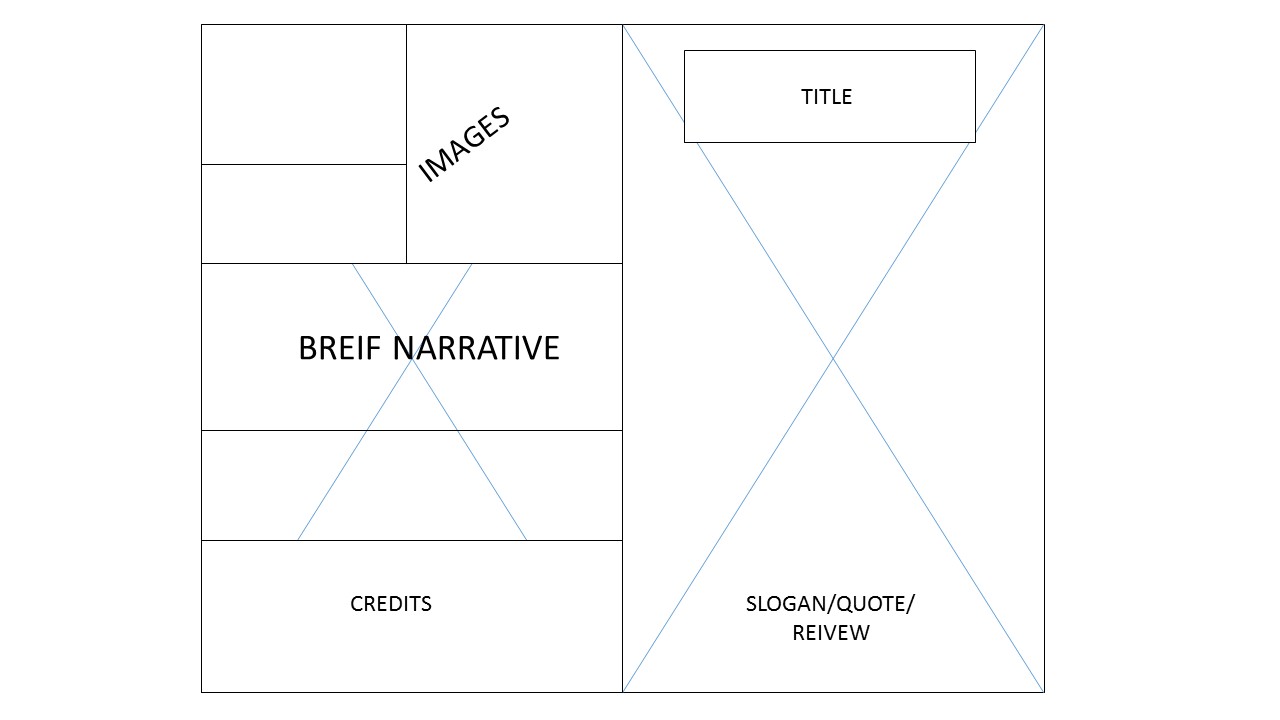
I have looked online via Google images at a variety of different DVD covers, to see the different styles. All of these are from different genres but that does not necessarily mean that these are the conventions for the different genres, I have chosen these because of how different they are in comparison to each other. It helps to see what the expectations are depending on the budget, for example the Hunger Games cover has a lot more to the detail of the cover in comparison to Friends with Benefits which had a much lower budget. Therefore this is the aim/goal to get to with my front cover.
Some of the similar conventions that I have found though are:

  • The title is much larger than any other text on the cover
  • all of the main actors names are located at the top of the cover.
  • there are a variety of different pictures on the back to give an insight of what will be in the film. 
  • There is a brief summary of the narrative so the audience know what to expect.
  • The main image is of the main characters
  • The credits are located at the bottom back of the cover.
  • The barcode is either at the top of the back or on the side at the bottom. 


Tuesday, 6 December 2016

Still images research/collage

I have created some collages to do with different coming of age films. The main idea of this is because some production companies use still images as some of their print products, for example their posters or front covers. I have also decided to use this to understand the mies-en-scene of each coming of age films. This is so I can decide what the background will look like in my filming as well as potential pictures as extra development for my work. I feel that during my videoing I am going to take photos which will also be a part of my production, incase I cannot screenshot photos from the video that I think will work.

'Laggies'

Ghost World


Perks of being a Wallflower


Thursday, 1 December 2016

Montage examples:

These are examples of montages from different films which are from a variety of different genres. This is to be able to see the change between characters or the themes. This links towards my film trailer as there are various different montages to show the change and the friendship between Luna and Tessa that is strengthening. I have taken montages from the films:

Eddie the Eagle 

Rocky

Ferris Bueler 

Clueless

UP

Wednesday, 30 November 2016

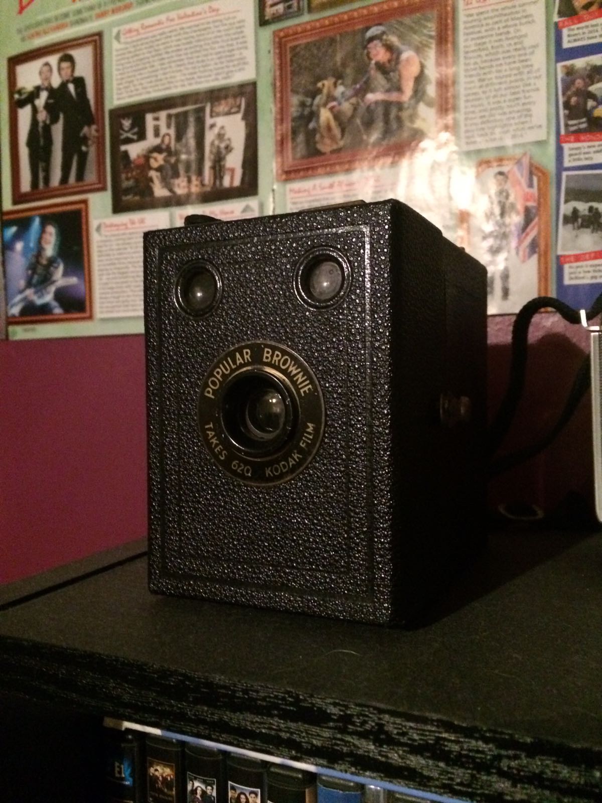
Cameras : Prop selection

I have found a selection of different cameras that I can use as a prop. I think the third one down will be the most appropriate prop to use for the time period as well as the genre of film.


Photoshoot for print product schedule


This photoshoot will be to test my actual style of photos whereas for my actual photos I will not be using planned photos as I want to get a photo which will link closely to the montage's that are going to be edited into the trailer, my idea for the photo will be Luna and Tessa sitting in the park and laughing, having a good time, or a photo of them filming for the documentary, this is so that the picture looks more professional and not staged, which is some of the conventions you would find in an Indie/coming of age film.

Title design ideas?:

From looking at some of the feedback I got from my audience, I have decided to go with the variation in typography, however I now need to look at the colours and style of the title. From this and the research I have done into contrasting colours I have decided that I am going to use contrasting colours within the title. The two main colours that stuck out to me the most were yellow and purple as these do relate to the characters and their attitudes. From this I made a colour design of the title. However I also thought it would be a good idea to try with another colour to see what the audience preferred.


Feedback: